


When you woke up this morning, what did you expect to do? Go to school? Hang out with people? Work?
Hang on. Let me rephrase.
When you woke up this morning, what did you *not* expect to do?
Read a blogpost on signage in the Toronto subway, probably.
And yet, here you are.
I think that most people would agree, the signage on the Toronto subway is pretty bad.
For one, it is so inconsistent. There are five generations of signs used across the network, heck, sometimes all five might even be found in the same station. Fairly evidently, this is bad for user experience. The lack of visual branding is incredibly disorienting and it gives the impression that the system is poorly managed. If you can not even make your signs work, how can anything else be done well?
But putting this gripe aside, there are bigger problems vis a vis functionality.
Let us look at a few signs I noticed on my commute from downtown to Scarborough a few days ago.

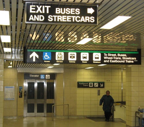
I can see where Eastbound Trains are, but where are Westbound ones? No sign to be seen.
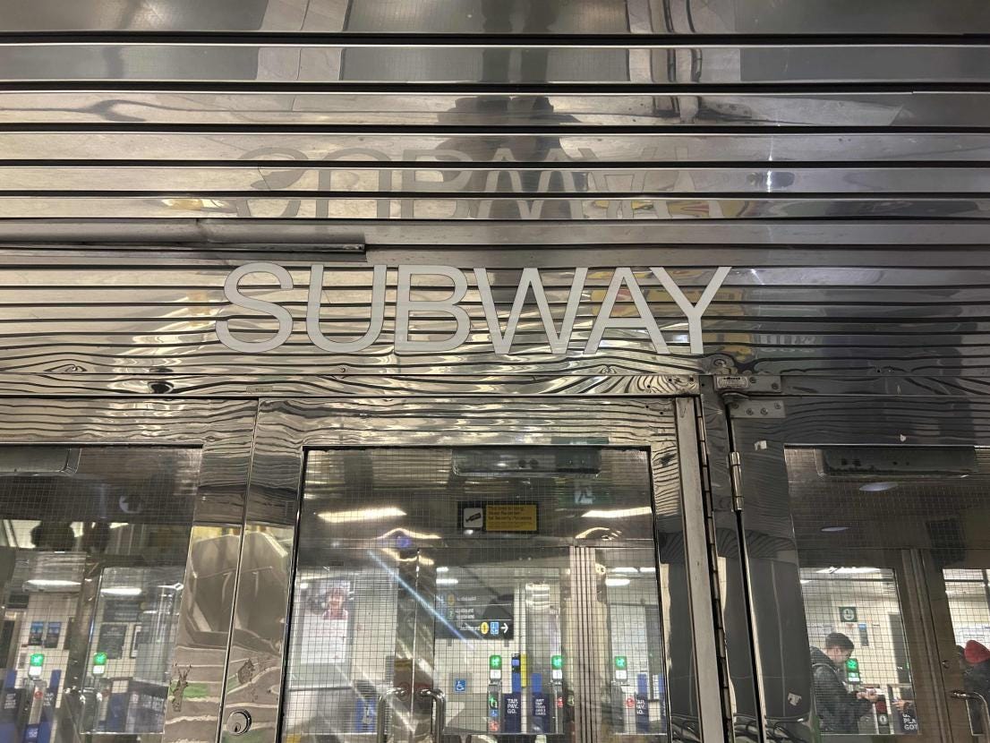
What Subway is this? The sandwich shop? If you can even make out the faint silver letters that say “Subway,” that is.
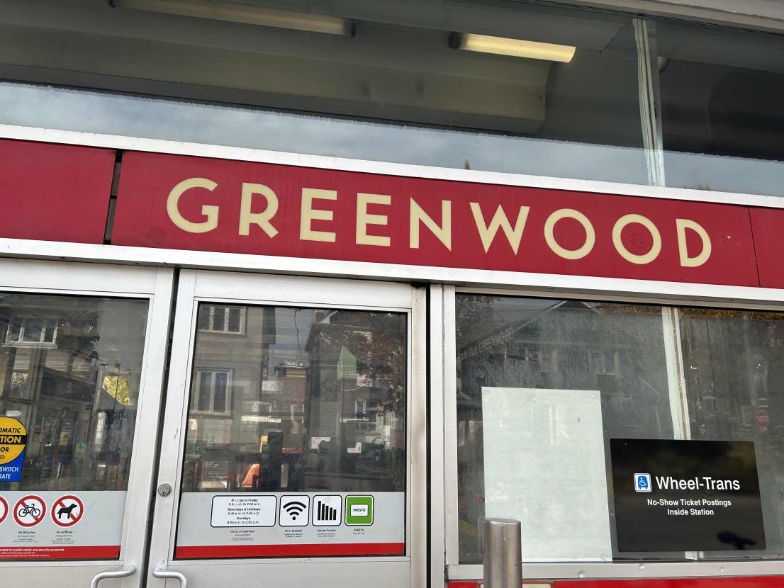
What is “Greenwood?” Is it the entrance to a subway station? A coffee shop? An apartment complex? I guess we will never know.
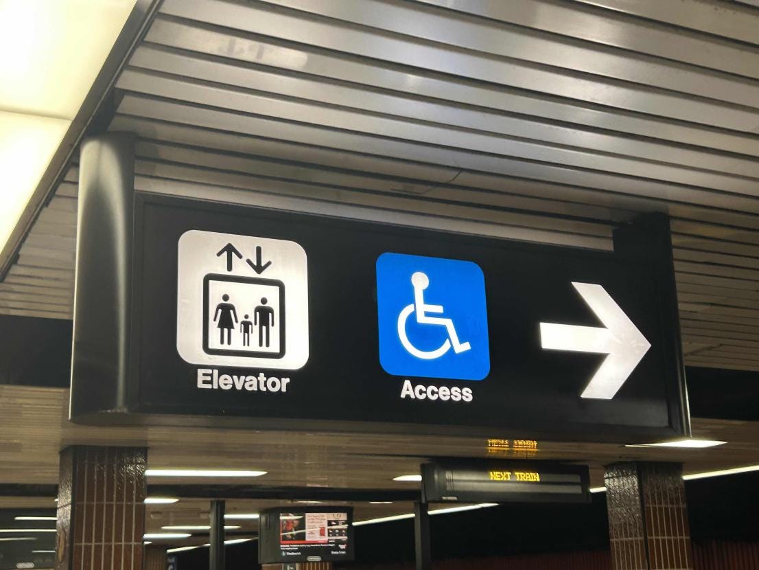
Oh look. It is an elevator with *access!* Access to where though?
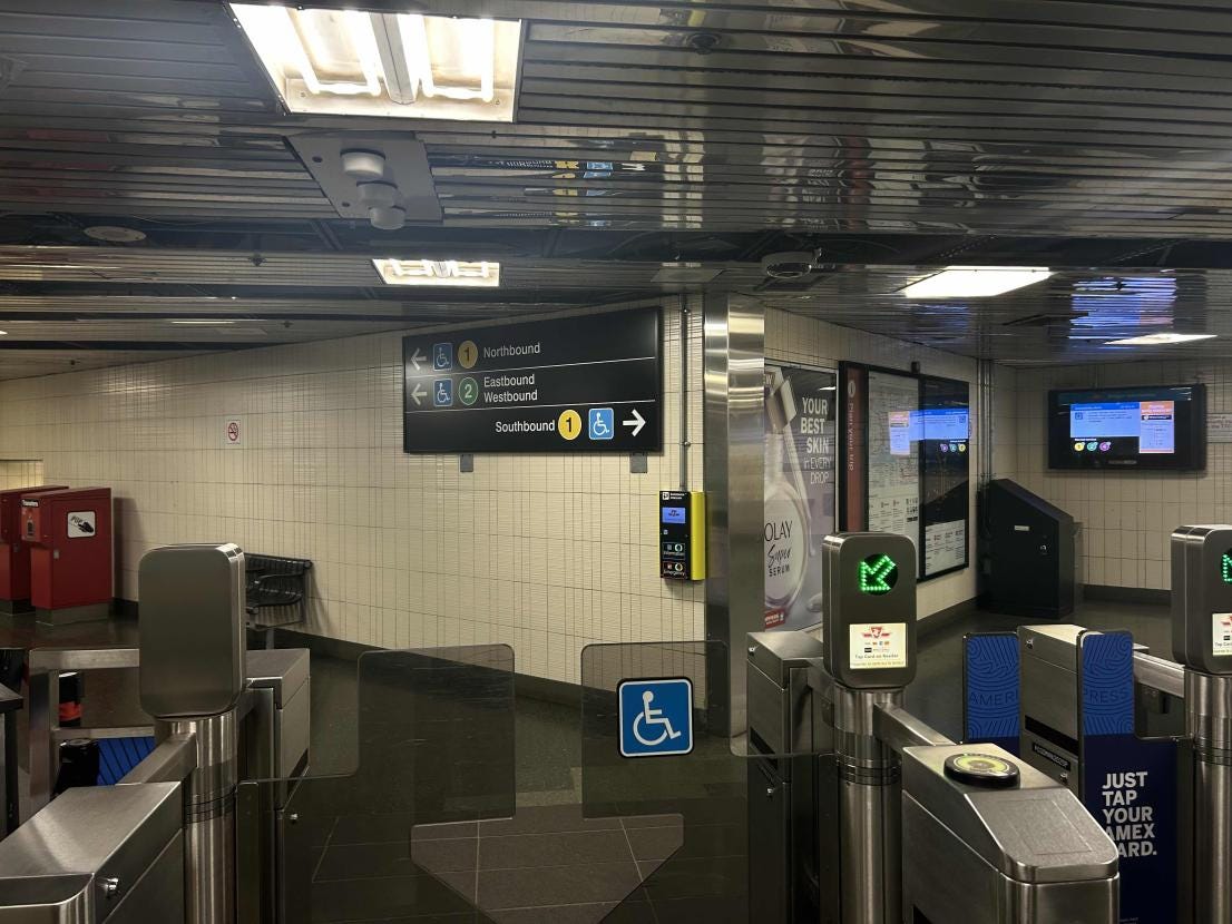
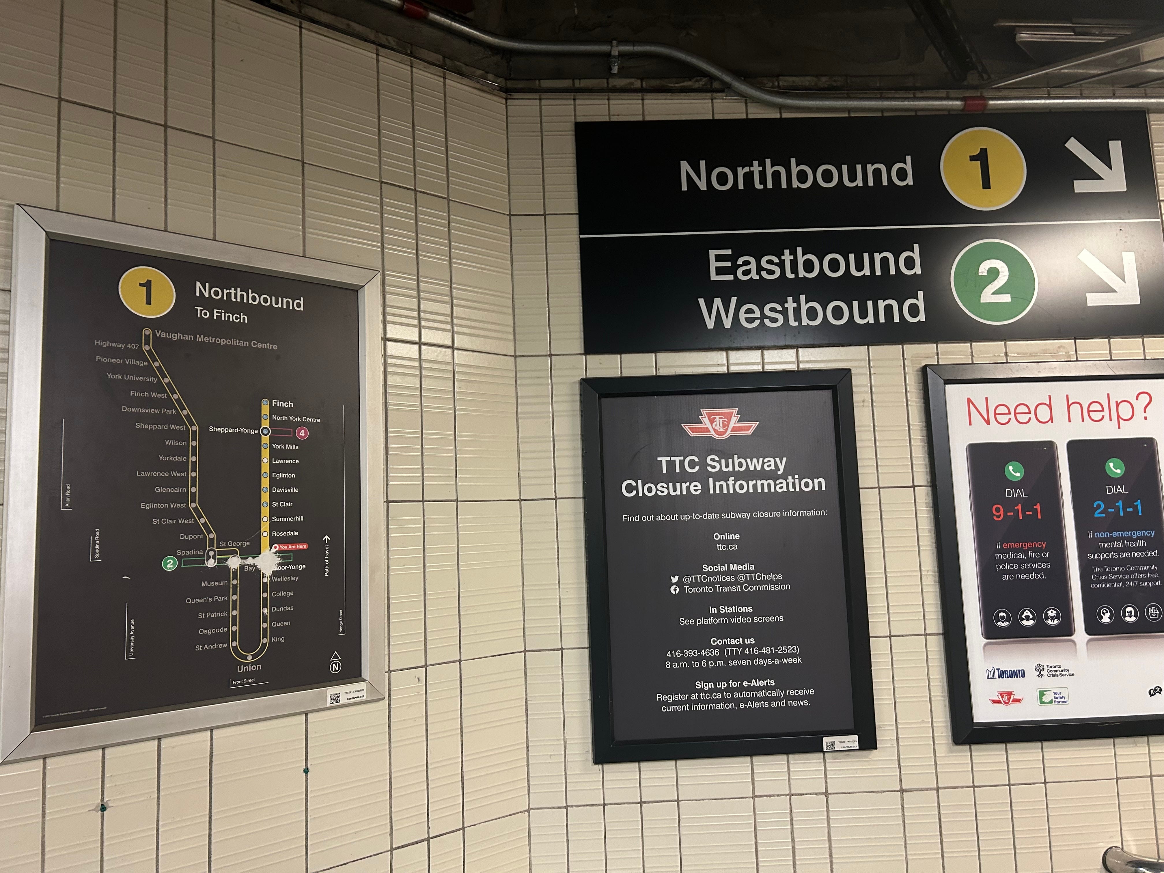
Line 1 Northbound or Southbound? Here is the kicker. Line 1 is a U-shape. So from this station (Bloor-Yonge), if I was traveling to anything west of St. George, I would still be heading Northbound but would have to somehow know that I should follow the signs for Southbound. Confusing.
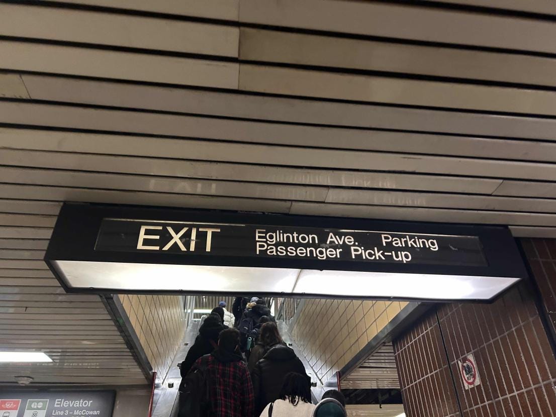
This exit, does it go to the Eglinton Ave. Parking? Or to Eglinton Ave. AND Parking. Oh, and it actually leads to the bus terminal as well. But you would not know that from the sign.
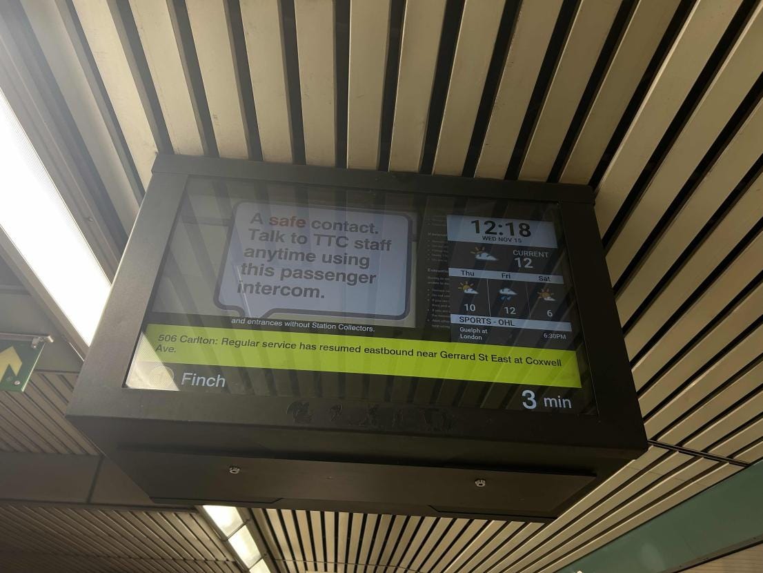
Want to figure out when the next train is coming? I guess you will have to stand right under the screen, because on the massive TV screen the actual important information is relegated to a tiny corner.
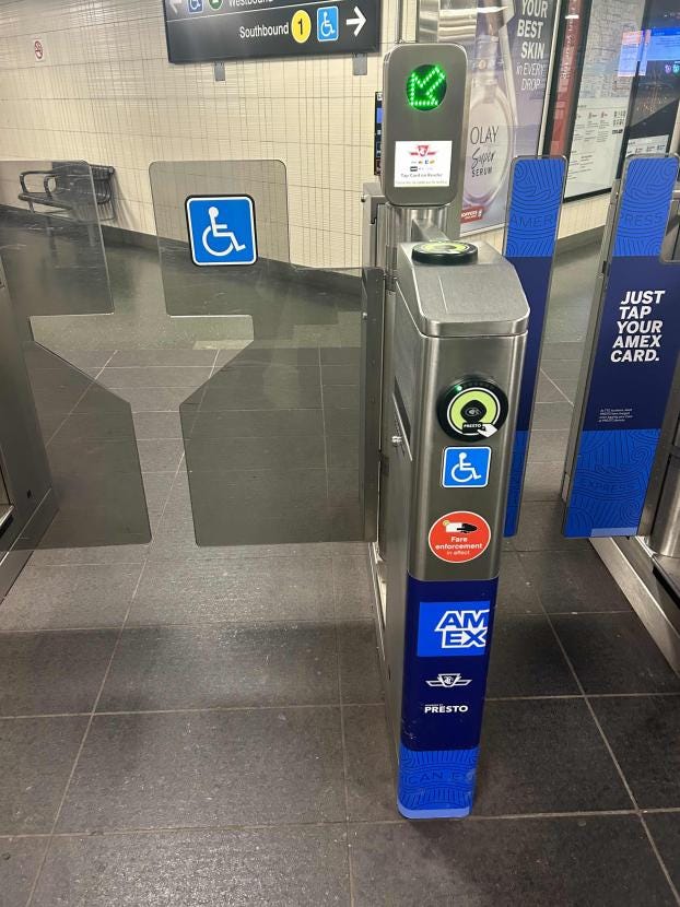
Although this is not technically a sign, looking at these gates covered with marketing you would think that you can only tap your PRESTO or American Express card. Little would the common man know, any other contactless card works as well.
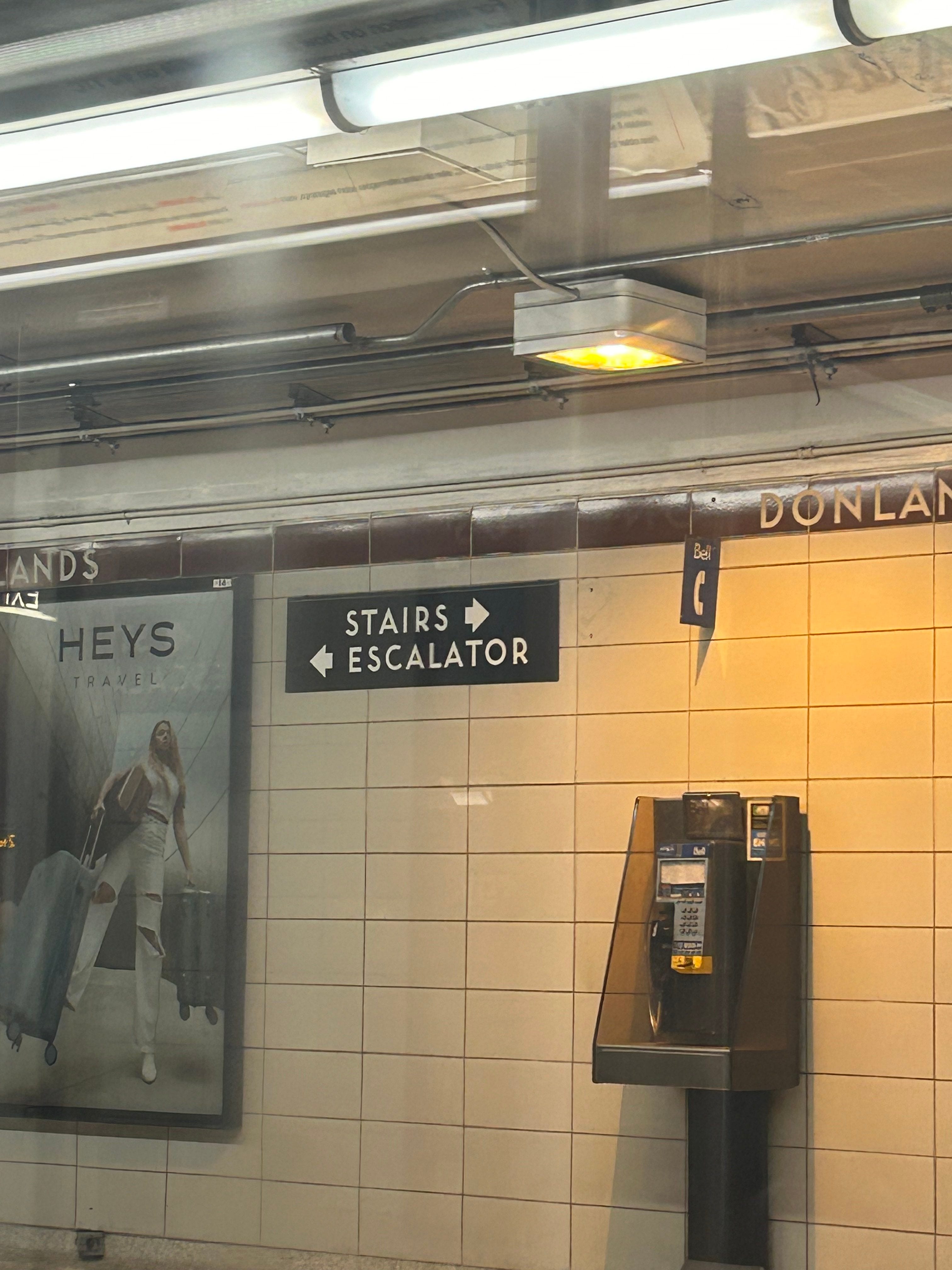
Stairs. Escalator. TO WHERE??? THE MOON?
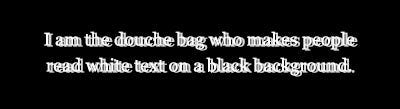
Looking at this one, you will notice that it is not in fact a TTC sign. But for many people with vision impairments, this is how they see backlit white text on black background. So, basically every TTC sign ever. And that is an accessibility problem.
—
Point is, from an intuitive user perspective, the signs are not great.
So how do we make them better?
Well it is first important to understand how people interact with signs.
Contrary to popular belief, signs are not just (or at least should not just be) put up based on vibes. Rather, there are people who spend their whole lives researching ways to make them better (seriously, go and search it up).
Underpinning their study is a basic underlying premise - when people are in public, they do not use their brains.
Consider this situation. A few weeks ago, I was at the airport waiting to board a flight. The gate attendant comes onto the PA system: “form two lines!” No response. So she says it again: “there are two of us scanning boarding passes. Please make two lines. Two lines!” Slowly, people begin to form two lines.
Less than a minute later, I look at the boarding area again. Guess what. It was back to one queue.
Like boarding airplanes, creating signs is not easy. It is a science, which, when done right, is based on several key principles.
The first is the concept of decision thresholds. Every time someone is presented with options on what they can do - turn left, turn right, scan through the gate, go up the stairs, use the machine, etc., they need information to make that choice.
The job of wayfinding (the study of signage) is to give them that information. Fairly straightforward, right?
Below is a infographic from Metrolinx’s wayfinding standards about some sample decision points.

From here, what logically follows is that whenever there is a decision point, the relevant signage needs to be provided. Sounds pretty straightforward.
Well, you remember what I said about how people do not engage with signs in a very intelligent manner? Chances are, if there is an overwhelming amount of information, they will at best miss something or at worst simply ignore the whole sign. The opposite is also true - if you do not give people enough information, rest assured that your average rushed commuter will not be filling in the gaps that the sign missed.
This leads us to the second principle, progressive disclosure. It tells us that at each decision point, signs should provide people with the information they need to make that specific decision. Nothing more, nothing less.
The important implication of this is that the signage gradually discloses more and more information as someone walks through the station (hence, “progressive disclosure"). When travelers are outside, they might only need to know that this is a subway station, so that is all you tell them. Then as they get to the ticket machines/fare gates, people might want to see if the trains are running well to determine if they should buy a ticket. So there should be a screen showing service updates.
The next decision point will probably be if they head downstairs or not, and for this, a sign that says, “Subway” with an arrow down is sufficient. Then, let us say they arrive at a landing. There is a flight of stairs continuing down to Line 1 and a path that continues straight to Line 4. This is where the rider needs to decide which route they are taking, so this is where the signs should show the actual train line number. Not before - because up until this point, they have no use for that information. And this principle continues at platform level, on trains, when exiting the station, etc.

The third principle is prioritization. And the reason for this one is the same - there is only so much space on signs and you want people to be able to find the place they are looking for in as short time as possible.
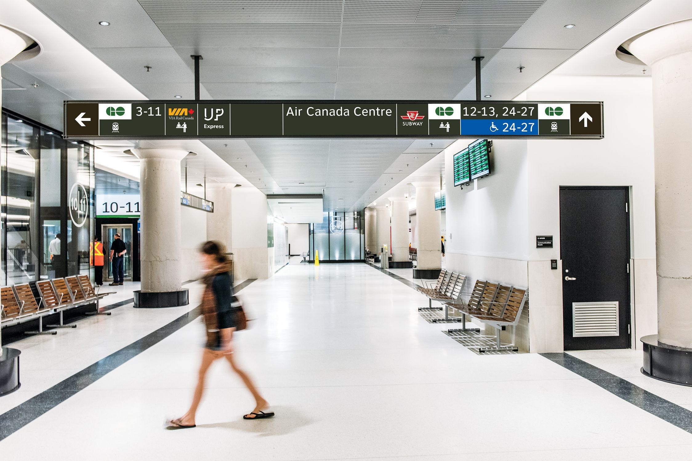
Consider the sign shown below. Although not technically a TTC sign, it exemplifies very nicely how not to apply this principle.
Where do you think that the average commuter in the York Concourse at Union Station is trying to go? VIA Rail? Platform 6? The TTC? All good answers.
But you know what is not a good answer? The Air Canada Centre. Yet that is the piece of information that’s most centrally shown here (side note - there are so many other problems with this sign - what do the numbers mean? How would a visitor know that UP Express is actually the airport train? Why is it so unclear which things are straight ahead and which are to the left?).
The prerequisite to properly prioritizing information is finding out where people actually want to go. This makes use of traffic modelling, observation, and data analytics to determine people’s walk patterns. Metrolinx calls the main routes people take “priority thresholds” and the less traveled paths “secondary thresholds,” with other agencies using different names.
Once this is determined, signs must be set up so the most visually salient aspects correspond to these priority thresholds. Usually, this is on the center-right side of the display, but will vary by display height, angle, etc.
An interesting question that arises here has to do with “contingency thresholds” - when someone has made a wrong turn at a past decision threshold and is now on a path they are not supposed to be taking. For instance, if the previous sign along the hallway said buses turn left, does the next sign in the same hallway still need to contain information about buses? There is no right answer , and there is actually considerable debate about how important contingency signage is. On one hand, it does improve the user experience (remember: people love to ignore signs), but it also leads to extreme clutter and crowding out of more important information.
Closely related to prioritization is the materiality principle. I remember first hearing this term in an accounting context, where it describes only needing to include things on financial statements that will have an actual impact on user decision making. In wayfinding, the meaning is slightly different - what it says is do not repeat information.
Consider this sign

How many times can it tell the user that the exit is on the right? Let us count
The little green man
The words “Exit”
The words “Woodbine Avenue”
Is all this information really necessary? Does repeating “exit” three times add any actual value between cluttering things up? Probably not.
Just the words “Woodbine Avenue” or “Exit” are probably sufficient.
The fifth principle is all about positioning. And if you guessed that it is about where the sign goes, then good for you.
A common sense interpretation is that signs should be placed at decision thresholds, but in many contexts, they should actually be just beyond the physical location of the threshold so as to leave some “reading space” in front of them. They should also be facing perpendicular to the direction of travel so that they are immediately noticeable - almost never parallel.
Some signs are “supporting” signage - that is, they provide additional information which is too complex to put on the main sign. A textbook example of this is the little line diagrams which show direction of travel (pictured below, on the left). These signs supplement the primary sign (in this case the (1) Northbound on the right) and are meant to be read in conjunction with them.
These signs should be placed close, but not too close to their parent sign. On one hand, someone who is confused by the parent sign should be able to quickly glance around and locate the supporting signage. On the other hand, putting it too close risks having people stop to observe this more information-heavy signage, blocking a key thoroughfare that the parent sign is likely located on. These types of signs are also called “slow signs,” meaning they are designed for someone to stop and read (as opposed to simply scanning them on the go).
The physical form of the sign also matters. Many transit systems in Asia and Europe have adopted floor signage, with continuous lines to guide users towards their destinations. This placement is a mixed bag - on one hand, it makes things much simpler as there is no need to constantly search above for arrows - simply follow the lines! Besides, most people’s natural inclination when they are walking is to look down anyways, so they are more likely to notice this wayfinding. The challenge is that, well, they are on the floor where people WALK. If I was on the edge of the walkway, and the lines ran down the middle and were hidden under hundreds of hurrying feet, then the wayfinding would not really help me.
Even within a sign, positioning matters - and this is the sixth principle. It should be easy to distinguish between the different elements on each sign and their relationship with each other. Where does one place end and the next begin? Which arrow connects to which? These are questions that the user should never have to ask - it should scream out at them.
For instance, look at this sign. If I want to go to the Great Hall, do I turn left or right? It requires me to scan the entire line, find the blank space, and then establish that the Great Hall is in fact lined up with the arrow on the far right side.
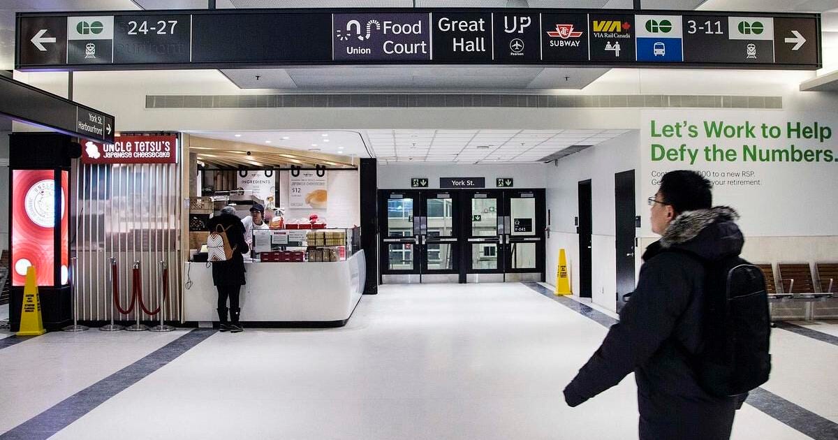
What specifically then is wrong with the positioning of elements on the sign?
a) Arrows need greater visual salience - reverse the colour scheme on those blocks only so you have a white background and grey shape
b) Too many elements positioned horizontally side by side - stack them vertically to maximize usage of space
c) Use a clearer divider between what is on the left and right side. Perhaps a thick white line or white block
d) Reposition the numbers to make clear that they correspond with the little GO Train symbol next to them (e.g., Platforms 24-27 are GO Train platforms)
The seventh principle then, is accessibility. Let us return to those with vision impairment. There is a general rule that for every ten feet the reader is from the sign, the text needs to gain an inch in height (keep in mind this is a diagonal height, so it includes the vertical component as well). What more, certain color combinations work better than other. Backlit white text on a black background is arguably the worst and should be avoided where possible (remember what we talked about earlier?).
But there’s another type of accessibility, and that is for those who don’t speak the language that the sign is in. The TTC tries to overcome this through their use of pictograms, but the success of these is dubious at best. Like honestly, imagine being a tourist to this city, trying to figure out what the difference between these four icons is. Now try doing it when you are standing in a crowded corridor with a mob of commuters pushing you on all sides and the sign is five meters away.

To be fair, linguistic accessibility is never an easy task. And I think there is a valid argument that aside from proper nouns (e.g., Woodbine Avenue, Air Canada Centre), signs really just use the same few words over and over again (e.g., Exit, Buses, Subway) that can easily be learned. So to that extent, there is no need for any sort of universal “code” especially if it comes at the cost of clutter/crowding out.
The seventh and final principle is a more aesthetic one, and it considers the role that signage plays in developing the visual identity of a system. The use of consistent, effective, and iconic signage can help define a place and how we view it.
Think about the London Underground. They use an established scheme for their signs network wide, with a unique font (did you know - Toronto has that too!), styling, color scheme, and text choices. Are there many valid critiques that can be made of their signage? Of course. But the sense of consistency across the network creates a distinctly LONDON feel that resonates with visitors all around the world.
So then, how does the TTC do on each of these principles? Well, not well. Lol. I don’t think you needed to me to tell you that. So instead of bemoaning this further, let us talk about some solutions.
Remove old signs.
This is arguably the more pressing issue of most wayfinding issues on the network. Many stations will have several generations of signs which contain overlapping (and sometimes even contradictory) information. Not only that, the older signs often use outdated terminology. At Islington, there is a sign that says “to Drive In Pick Up” - what does that even mean?
Or, look at this. I mean, honestly, what is it trying to say?
Not to mention, they are just so freaking ugly.
Adopt worldwide best practices in signage. These include:
Using lettered or numbered exits (e.g., Exit A, Exit B). This reduces the text that needs to be displayed on a sign, miniziming clutter and maximizing use of space. It also makes it easier to identify and remember which exit you need to take. More detailed information about where each exit goes can be shown on supporting signage to the side
Stop using cardinal directions (e.g., Line 1 Northbound). When a subway line is in a U-shape, the terms “Northbound” and “Southbound” do not provide any meaningful insight about the actual direction of travel. If I am going from Yorkdale to Sheppard-Yonge, I would be heading “Northbound” but the signs I need to follow would say “Southbound.” That is far too confusing. Start using terminus stations instead (e.g., Line 1 to Finch).
Adopt the Metrolinx Wayfinding Standard
Seriously. Like the TTC’s way of signing things is so broken I am not sure it is worth fixing. Through countless generations of signs, they still have not figured out a way to communicate where exits are, nor bus route diagrams, nor anything else for that matter. To be honest, I think we have reached the point that there is no point to try to develop a whole new standard. Is this just laziness? Possibly. But if the rest of the GTHA is adopting the Metrolinx standard anyways, even if just for visual consistency sake the TTC should probably jump on board.
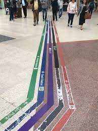
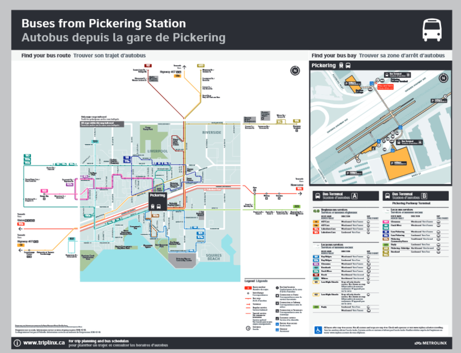
For one, Metrolinx has a lot of unique and innovative signage concepts that should be more broadly implemented. Consider this map design, which is an amazing slow sign at any sort of bus terminal decision threshold. Perhaps unsurprisingly, the TTC has nothing like it.
Or look at how they do platform level wayfinding:

Compared to the absolute disaster that’s the TTC.

You do not even need to understand the wayfinding principles to recognize that one is far superior to the other. In terms of organization, design, how they use icons, arrows, shapes, and just about everything else. Metrolinx actually has a clear layout that is quickly scannable while walking. There is a clear separation of elements, use of colour contrast to draw attention the arrows, and simplistic yet informative pictograms to complement the text. The TTC’s looks like it was made in Microsoft Word 1999 edition.
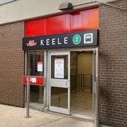
Here is another example. A (slightly lower res, I’m sorry) photo of the Keele station entrance. Note the information that progressive discourse theory tells us is unnecessary - most notably, the presence of the TTC logo. There is a lack of consistency as well - why is the bus icon shown for buses, but then the Line 2 icon used for subways?
Contrast that to the Metrolinx design. Much cleaner, higher contrast, and only gives the absolutely necessary information. A clearly better design - remember prioritization and materiality!

(Metrolinx does not back-light their signs, so the use of white-on-black is okay from an accessibility POV. I will say though, I am not a fan of the French).
Whenever I try to talk to someone about improving signs in TTC stations, I always get the response of “who cares. We have bigger things to worry about.”
And they are right. We do. Having good or bad signs will not make or break a transit system.
But we also must realize - this is not a massive investment. Sure, it may be low reward, but it is also low cost. Compared to just about anything else, it is just so darn cheap. Besides, signs have to be replaced over their lifespan anyways, so why not take the opportunity to do it better?
I think that part of the problem is the people who care about transit, they already know how to get where they need to go, and so signage is not something they worry about. Thus, the issue flies under the radar and receives very little attention. But for everyone else who may not be so familiar with the ins and outs of the system, they are the ones that need good wayfinding most.
Improving the transit user experience does not and should not mean that bigger problems do not get addressed. Whereas things like service levels are inherently political decisions, signage design is largely left up to the TTC itself. When was the last time you saw a city counciller make signage an election issue? All this is to say, it is much easier to get action on this issue because of how un-deep people’s passion for it is (except mine, of course. And if you’ve made it this far, probably yours too)
It is honestly not that difficult to put some better signs up in our subway system. And I do not know what we are waiting for.
This is a really low hanging fruit. Let us get it.
Image Sources
https://www.google.com/url?sa=i&url=https%3A%2F%2Fthpthoanghoatham.edu.vn%2Ftop-90-imagen-astigmatism-white-text-black-background%2F&psig=AOvVaw3Wo1JEoQcJV8CPCJNV_HeM&ust=1700175044856000&source=images&cd=vfe&opi=89978449&ved=0CBIQjRxqFwoTCIillN6Lx4IDFQAAAAAdAAAAABAM
https://www.google.com/url?sa=i&url=https%3A%2F%2Fentro.com%2Fproject%2Funionstation%2F&psig=AOvVaw1UhceNT7mrVwycLJJlJOmL&ust=1701327053457000&source=images&cd=vfe&opi=89978449&ved=0CBIQjRxqFwoTCPDfqKfP6IIDFQAAAAAdAAAAABAa
https://www.google.com/url?sa=i&url=https%3A%2F%2Fuclic.ucl.ac.uk%2Fcontent%2F2-study%2F4-current-taught-course%2F1-distinction-projects%2F1-17%2Fwanyu_fu_2017.pdf&psig=AOvVaw3xQ-d2IT6aLw3A3Gmkszg2&ust=1701328591616000&source=images&cd=vfe&opi=89978449&ved=0CBIQjRxqFwoTCPCX84TV6IIDFQAAAAAdAAAAABAy
https://www.google.com/url?sa=i&url=https%3A%2F%2Furbantoronto.ca%2Fforum%2Fthreads%2Fttc-redesigning-ttc-signage.18595%2F&psig=AOvVaw0RP0Sb-_6KJW6IU7bDnUN9&ust=1701329885201000&source=images&cd=vfe&opi=89978449&ved=0CBIQjRxqFwoTCMiaye3Z6IIDFQAAAAAdAAAAABAR
https://www.google.com/url?sa=i&url=https%3A%2F%2Fwww.thestar.com%2Fopinion%2Fstar-columnists%2Funion-station-and-path-signs-need-less-design-more-direction%2Farticle_4245af26-e221-5f56-930c-5fbb434fe982.html&psig=AOvVaw31QQhvLqpQtYbcMy7zT8B4&ust=1701331595114000&source=images&cd=vfe&opi=89978449&ved=0CBIQjRxqFwoTCPDXg53g6IIDFQAAAAAdAAAAABAF
https://s3-media0.fl.yelpcdn.com/bphoto/_GQ3olKBaQBQ3V1NT1sidQ/180s.jpg
https://joeclark.org/design/signage/TTC/2015/TTCWayfindingStandardsManual_201409.pdf
http://www.gosite.ca/engineering_public/DesignStandards/DS-03%20MTX%20Wayfinding%20Design%20Standard%20v3.4%20190830.pdf
post queens substack post goes hard